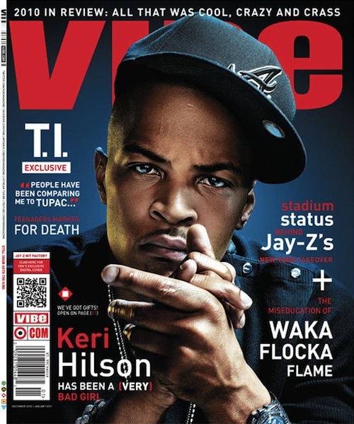
Good Points:
The masthead is big, bold and the colour scheme is very noticeable but the main image covers the centre of the masthead so it is complicated to tell what the name of the magazine is however, the audience may have been familiarised with this magazine so it shouldn't affect them at all. The background of the magazine cover is bizarrely dim and dull yet the lighting is able to emit enough to reveal T.I's face which is direct mode of address. As the rapper is looking directly at the camera, his hands are together in a rubbing stance which could connote dominance or a call for a challenge. The magazine includes the basic conventions for a magazine such as cover-lines which are limited and laid out perfectly and now many magazines are using QR codes which are more popular now. The cover also includes a dateline, bar code and a strap-line. The photography is remarkable and I am just astonished by how the background is dim but the main image is visible with a percent of light.
Bad Points:
The main image should have been more small as the image doesn't take much effect on the front cover unless it has a sign of dominance.
Bad Points:
The main image should have been more small as the image doesn't take much effect on the front cover unless it has a sign of dominance.
No comments:
Post a Comment