 |
| Vibe Magazine Contents Page |
The outline of the 'V' behind the 'Contents' represents and blends in with the whole magazine and the 'V' relates to the name of the magazine which is called Vibe. The 'V' appeals from the background but doesn't overcome the title to represent what the page is about so it won't attract unwanted attention.
The page is very enlightening and is simple to read to find out what the stories the magazine will contain. The main headings on top of the stories are in a elegant bold font to show that it is a main heading and what stories will be included in relation to the main heading. This helps readers be directed to whatever they want to read.
The artist is in direct mode of address to the audience that is reading the magazine and is appealing as the artist will entice the reader to read further in the magazine. The direct mode of address is modest and mysterious which will immediately attract the reader to read this magazine. Her dress also relates to the colour scheme in the entire page itself which doesn't take the attention off the magazine or the contents page.
The artist's legs lead to the title of the contents page which is effective as although her legs will attract people to turn to this page because it has the connotations of being seductive, promiscuous and sexy but they still have a meaning behind this as to why they are leading upwards to the 'Contents'. It basically attracts the audience to the main purpose of the magazine which is the title of the page. The artist's legs also make a 'V' towards the end to promote the magazine.
Overall, I think this magazine cover is more effective than Q's magazine contents page as it differs from simplicity and Vibe chooses to be different from other magazines. The title 'Contents' is more different to a simple one like Q's and it literally exercises the human eye to follow each letter like a trail and even though it may have less text than Q's contents page, it is limited and works around the main image and the main image itself looks more like a contents page image as it is medium-sized and not over-complicated.
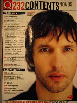
The headline of the magazine relates to magazine's masthead 'Q' which has white text with a red background to appeal to the audience and is more noticeable. The 'Contents' is in bold and is all in the same size to make it simple to read. In a simple plain grey layout, the date of this issue is stated which is 'Nov 05'. This magazine is a monthly magazine so simplicity is really all that is needed.
The main text on the contents page starts with a main heading to show what stories are coming up within the magazine but also relating to the heading. The page numbers are in plain bold red relating back to the masthead of the magazine 'Q'. The main headings are in white text with a black background and the stories are in a smaller font to show that they are stories and shouldn't be as noticeable than the headings. This makes it easier for the reader to pick the story they are interested in by finding the right bold title, go to the page via the page number rather than going through paragraphs of information.
This particular issue is a Lennon Issue which is a tribute to the late John Lennon and the text is in its own silver lined box with silver page number letters and this is appealing as it is a special part of the magazine and it is different to the page as it hasn't got the same colour scheme as the other text which cuts it off the rest of the page.
The main image in the contents page is James Blunt and this image is fairly large for the contents page as it looks more like a front cover image and it uses up the middle and right columns in the rule of thirds. as it is distinctively large, the audience will most probably wander towards it and the eyes of James Blunt shows direct mode of address which is another way of enticing the audience to have a look at this magazine. At the bottom of the page, it shows the regular things that feature every month in this magazine such as subscriptions, Q Mail, Cash for Questions and The Crossword. These are in every issue of Q and the reader can establish from this section what s new in the magazine and what is normally featured in this magazine.
There is a banner which runs along the bottom of the page indicating a special feature of a well-known artist including the page number. The editor of this magazine picked this story as he thinks it will be very popular and essentially created a shortcut.
In general, this contents page is very simple as it is not all over the place or too messy but easy to read and follow. It has a simple title with a basic listing of the stories within the magazine on the left third but the only let down is the rather large yet dominant image of James Blunt. This is a let down as it looks more like a front cover image and I think contents page images do not have to be that big but should instead have to 2 or 3 medium sized images to redeem this mistake. But yet it is a simple contents page as readers don't want to spend too long on a contents page so this is simple, easy to read yet detailed enough to find exactly what you want and remaining an attractive page to look at.
Overall, I think this magazine cover is more effective than Q's magazine contents page as it differs from simplicity and Vibe chooses to be different from other magazines. The title 'Contents' is more different to a simple one like Q's and it literally exercises the human eye to follow each letter like a trail and even though it may have less text than Q's contents page, it is limited and works around the main image and the main image itself looks more like a contents page image as it is medium-sized and not over-complicated.
 |
| Q Magazine Contents Page |
The main text on the contents page starts with a main heading to show what stories are coming up within the magazine but also relating to the heading. The page numbers are in plain bold red relating back to the masthead of the magazine 'Q'. The main headings are in white text with a black background and the stories are in a smaller font to show that they are stories and shouldn't be as noticeable than the headings. This makes it easier for the reader to pick the story they are interested in by finding the right bold title, go to the page via the page number rather than going through paragraphs of information.
This particular issue is a Lennon Issue which is a tribute to the late John Lennon and the text is in its own silver lined box with silver page number letters and this is appealing as it is a special part of the magazine and it is different to the page as it hasn't got the same colour scheme as the other text which cuts it off the rest of the page.
The main image in the contents page is James Blunt and this image is fairly large for the contents page as it looks more like a front cover image and it uses up the middle and right columns in the rule of thirds. as it is distinctively large, the audience will most probably wander towards it and the eyes of James Blunt shows direct mode of address which is another way of enticing the audience to have a look at this magazine. At the bottom of the page, it shows the regular things that feature every month in this magazine such as subscriptions, Q Mail, Cash for Questions and The Crossword. These are in every issue of Q and the reader can establish from this section what s new in the magazine and what is normally featured in this magazine.
There is a banner which runs along the bottom of the page indicating a special feature of a well-known artist including the page number. The editor of this magazine picked this story as he thinks it will be very popular and essentially created a shortcut.
In general, this contents page is very simple as it is not all over the place or too messy but easy to read and follow. It has a simple title with a basic listing of the stories within the magazine on the left third but the only let down is the rather large yet dominant image of James Blunt. This is a let down as it looks more like a front cover image and I think contents page images do not have to be that big but should instead have to 2 or 3 medium sized images to redeem this mistake. But yet it is a simple contents page as readers don't want to spend too long on a contents page so this is simple, easy to read yet detailed enough to find exactly what you want and remaining an attractive page to look at.
No comments:
Post a Comment